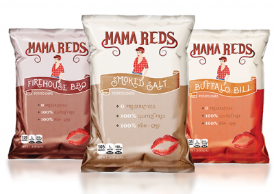
MAMA REDS POTATO CHIPS
Type: Packaging, Logo Design, and Branding
Role(s): Graphic Designer & Copywriter
Tools: Adobe Illustrator & Adobe Photoshop
01 Background
This project was created for my packaging class in college. I created a fictitious potato chip company called Mama Reds Potato Chips. The company is founded in Ohio, and takes a lot of inspiration from western motorcyclists and motorcycle culture.
02 Research, Concepts, and Design Process
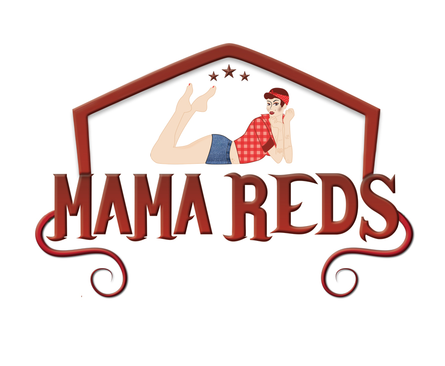
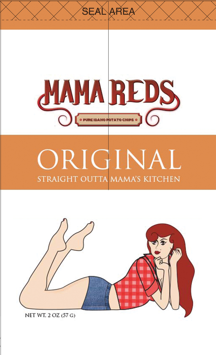
The inspiration of the brand identity came from the attitude and demeanor of western motorcyclists, and the 1940’s pin-up era. During the first stages of logo development I tried to incorporate both the company mascot and text as the main logo for my brand.
One challenge I faced was awkward negative spaces that made the two elements feel separated from each other. As a solution, I decided that the two elements should be separated, but still work together in the packaging itself. As a result, the text can be displayed as the primary logo, while customers can still look for the image of Mama Reds on the physical packaging.
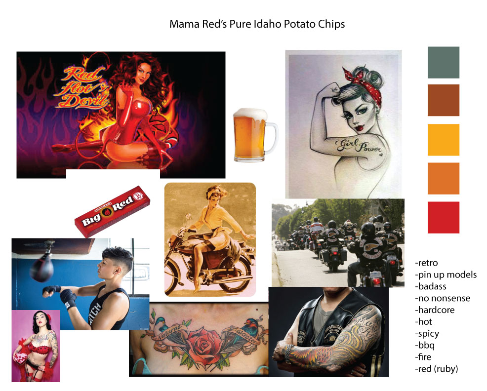
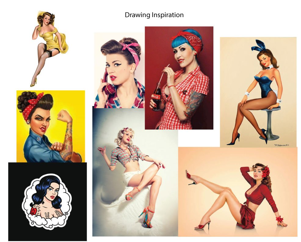
Mama Reds Brand Identity Moodboards
Previous logo and packging concepts
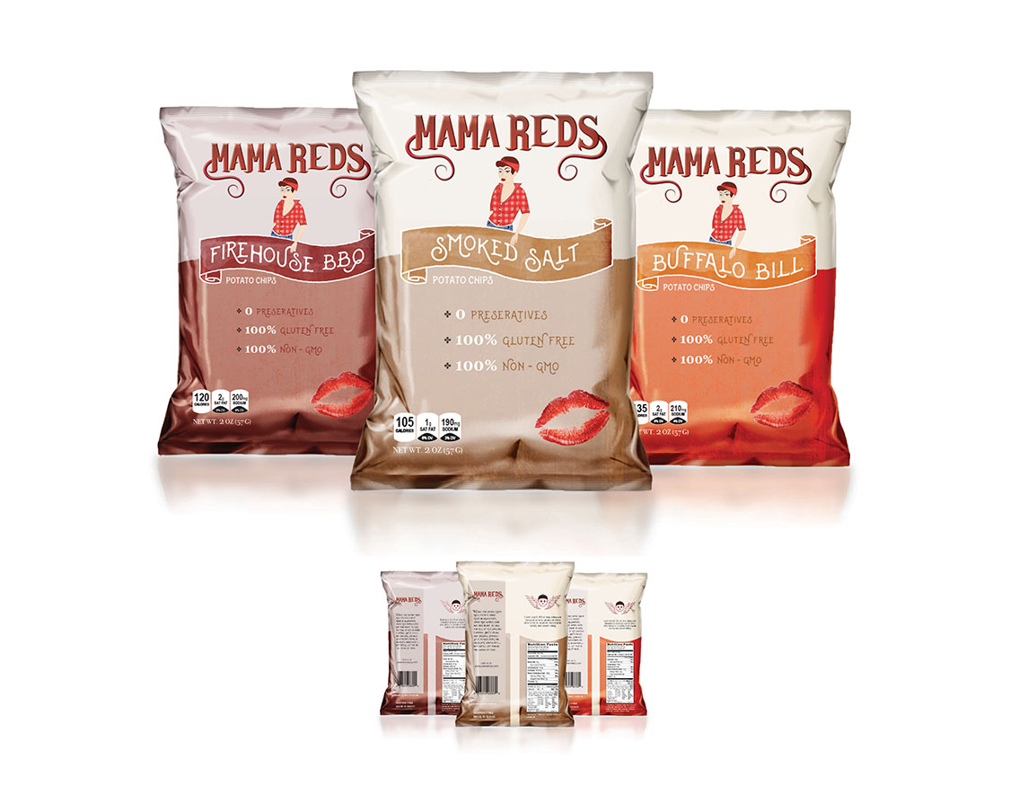
03 Final Design
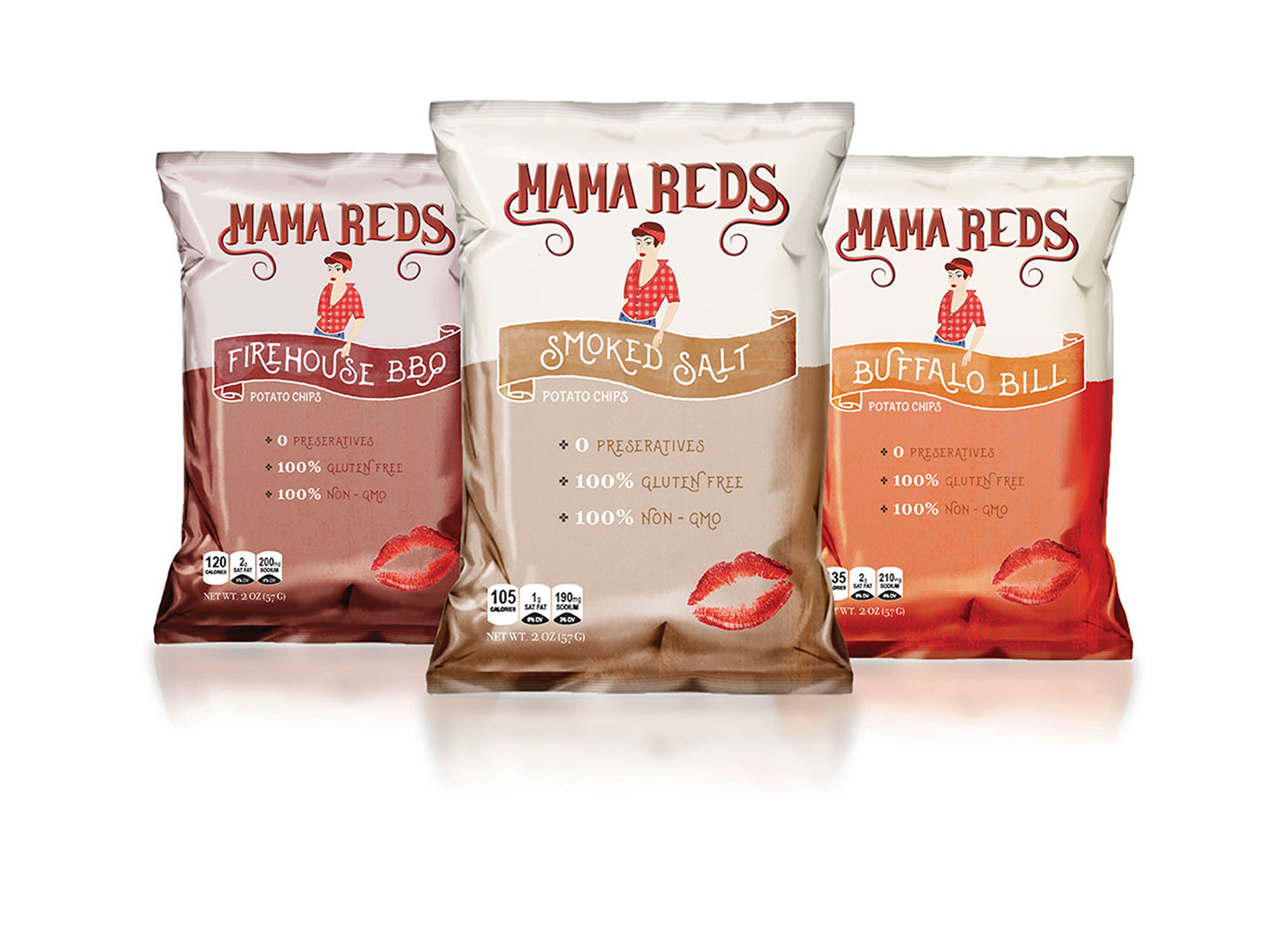
With the logo finalized, the package design became much easier to create. The potato chip line consists of four flavors that are colored and formatted with inspiration to western motorcycle bars, and nods to the approval of Mama Reds herself.
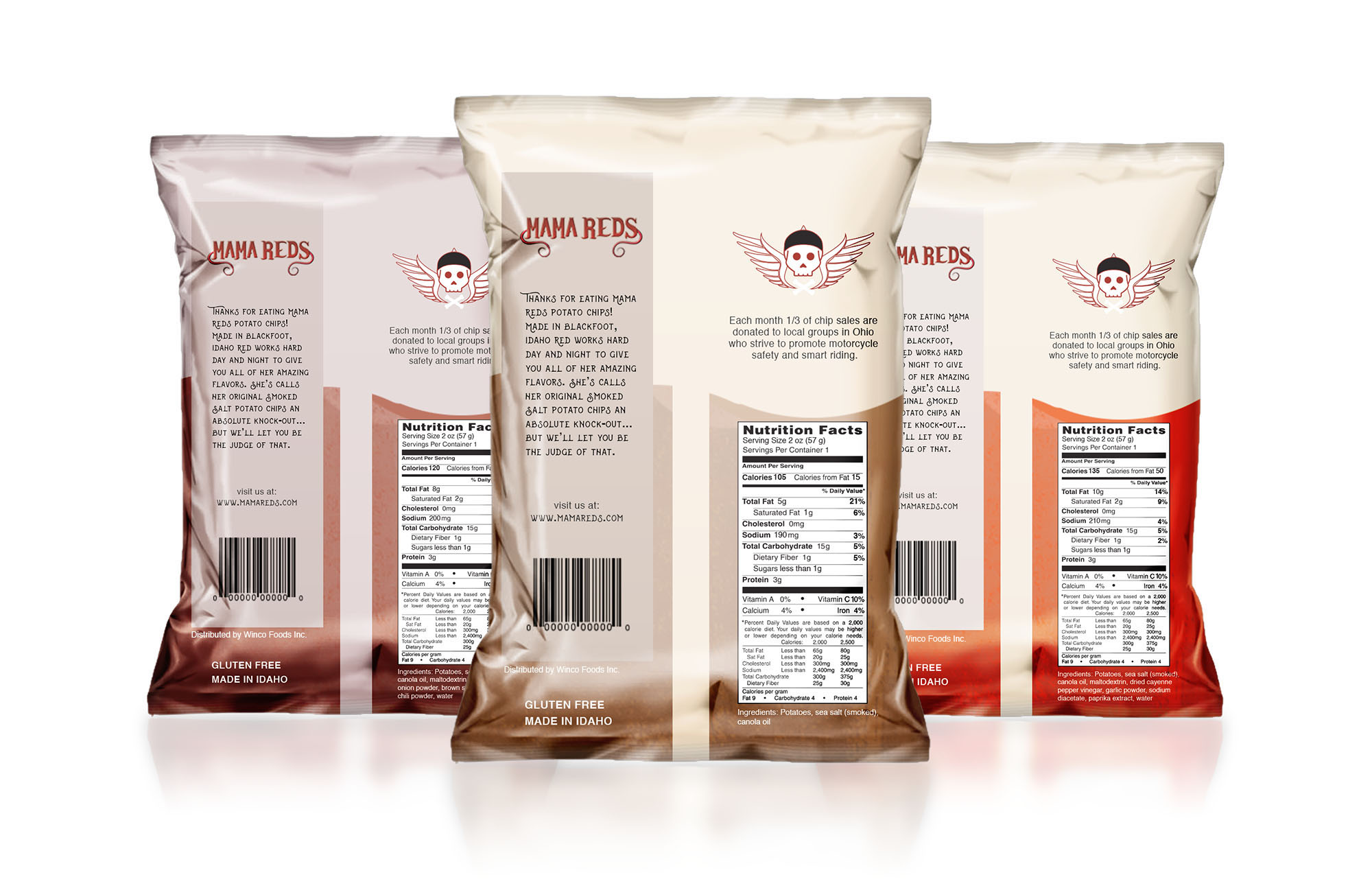
Upon the final designs of the company, on the back of every bag customers are aware that each purchase they make to the company donates ⅓ of the proceeds to local motorcycle groups in Ohio that strive to promote motorcycle safety and smart riding practices.


Copyright by Natalie Wiggins Designs 2024