LE MILLEU CAFE + GALLERY
Type: Packaging, Logo Design, Corporate Identity, and UI Design
Role(s): Graphic Designer, Copywriter, Photographer, UI Designer, and Web Developmer
Tools: Adobe Illustrator, Adobe Photoshop, Adobe InDesign, and WordPress

01 Background
This project was created for my Senior Studio in college. I created a fictitious coffee shop named Le Milleu Cafe + Gallery.
The name is taken from the French word “le milieu” meaning “social environment.” The cafe allows creatives to showcase their work while enjoying a bite to eat and socializing with others. The main elements of this project are corporate identity, restaurant branding, food packaging, advertising, and web design.
02 Research, Concept, and Design Process
The first stages of the project were focused on corporate identity. I came up with a design brief for what Le Milleu’s branding should represent and went with the feel of “contemporary, minimal, and chic”. With this aesthetic in mind, I went through numerous revisions with the logo and finalized with hand-lettered text that was manipulated and edited through Adobe Illustrator.
Packaging and Corporate Brand Elements
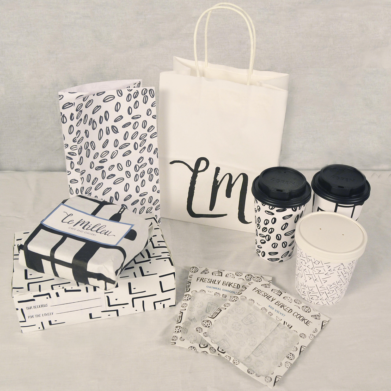
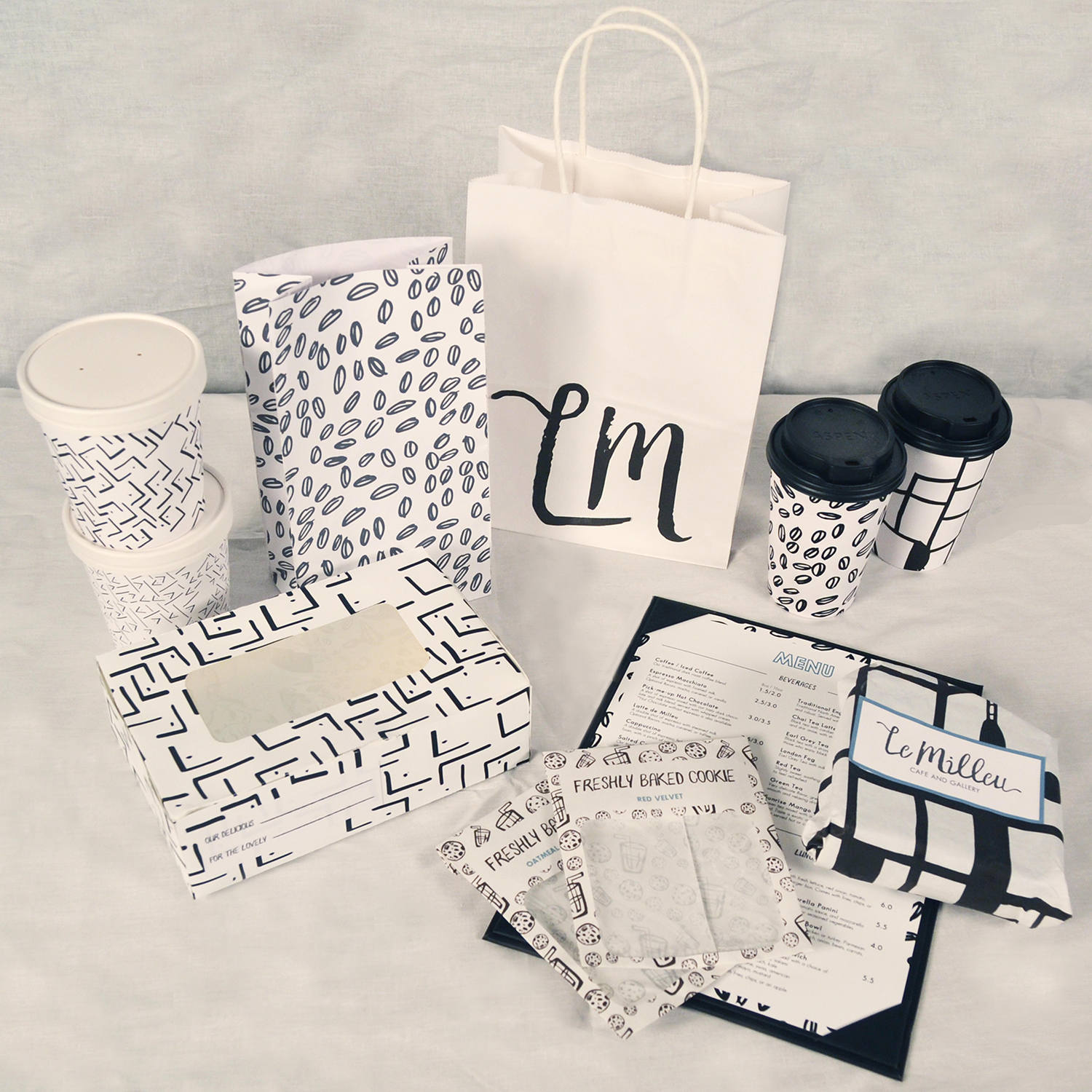
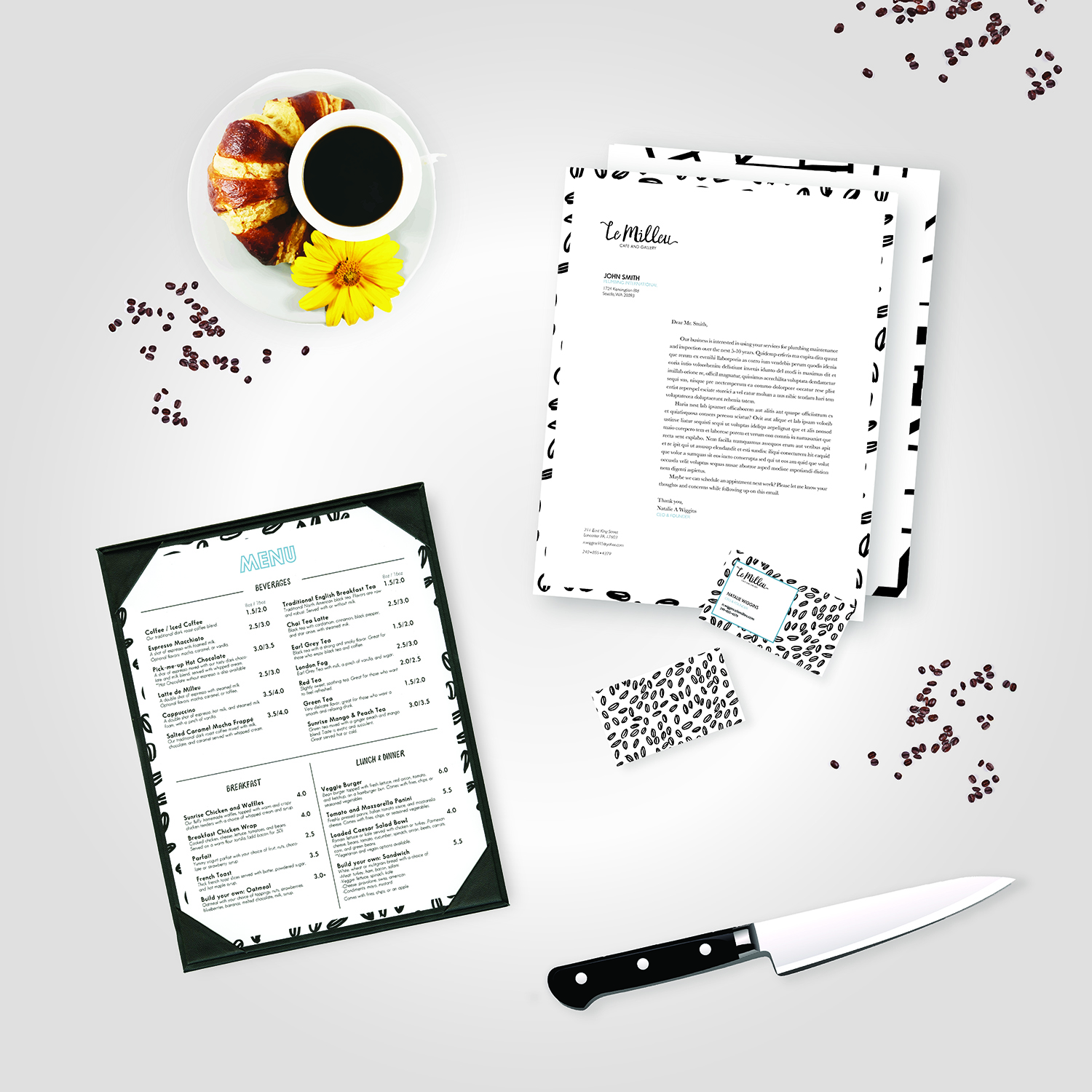
The next stage was tackling the packaging and additional branding elements. I stuck with the look of hand lettering and created my own patterns to compliment the packaging with the companies logo. I chose these patterns to be a distinctive element of Le Milleu’s brand aesthetic.
Poster Designs
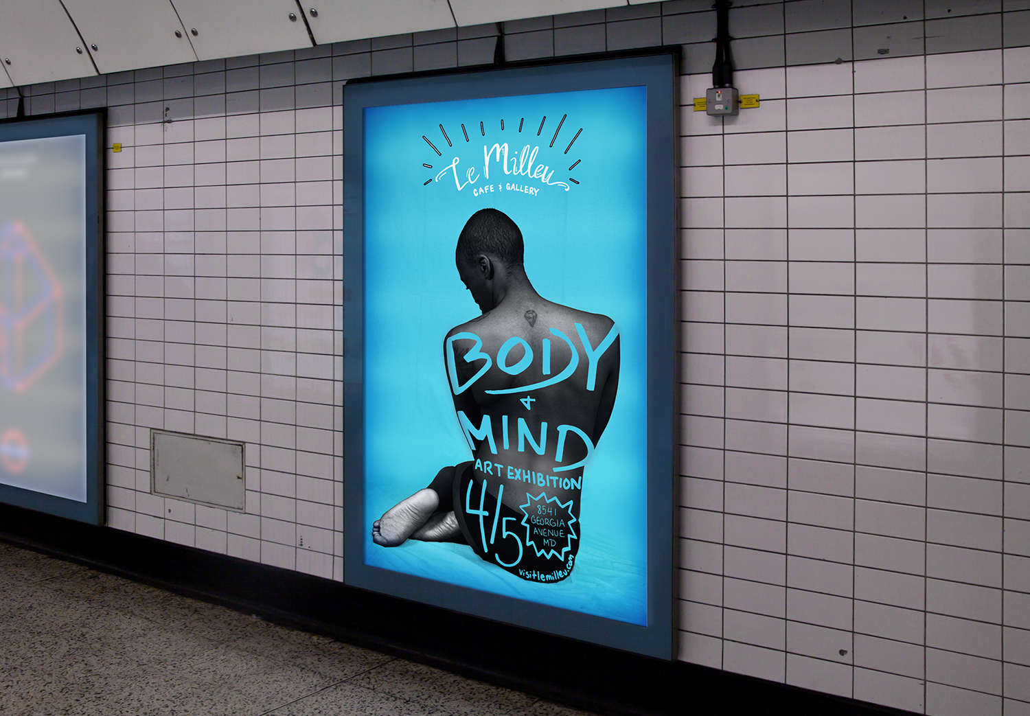
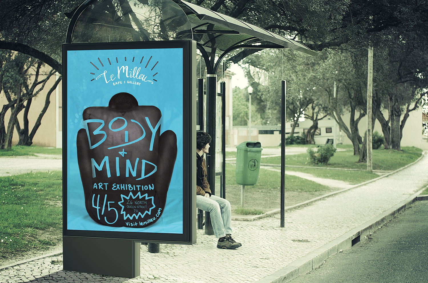
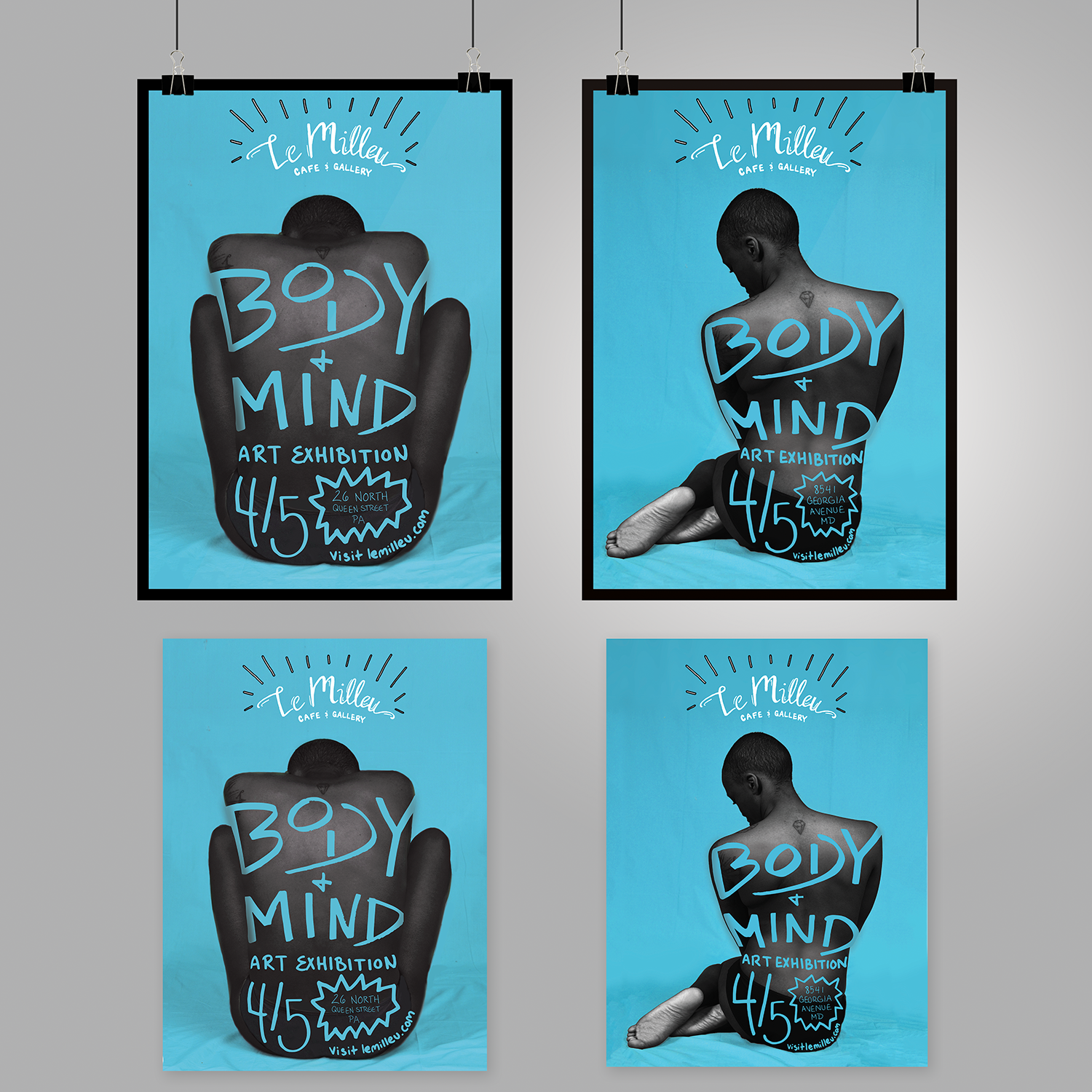
You can also see the hand-lettered type treatment for the companies promotional posters for their “Body + Mind Art Exhibition”. I did a photo-shoot with model, Margi Warner, to create bold and contemporary imagery that compliments the cafe’s brand. I didn’t want the poster to have any disconnect from its brand identity, so the use of hand lettering and color creates a familiarity for customers who are familiar with the brand.
Website
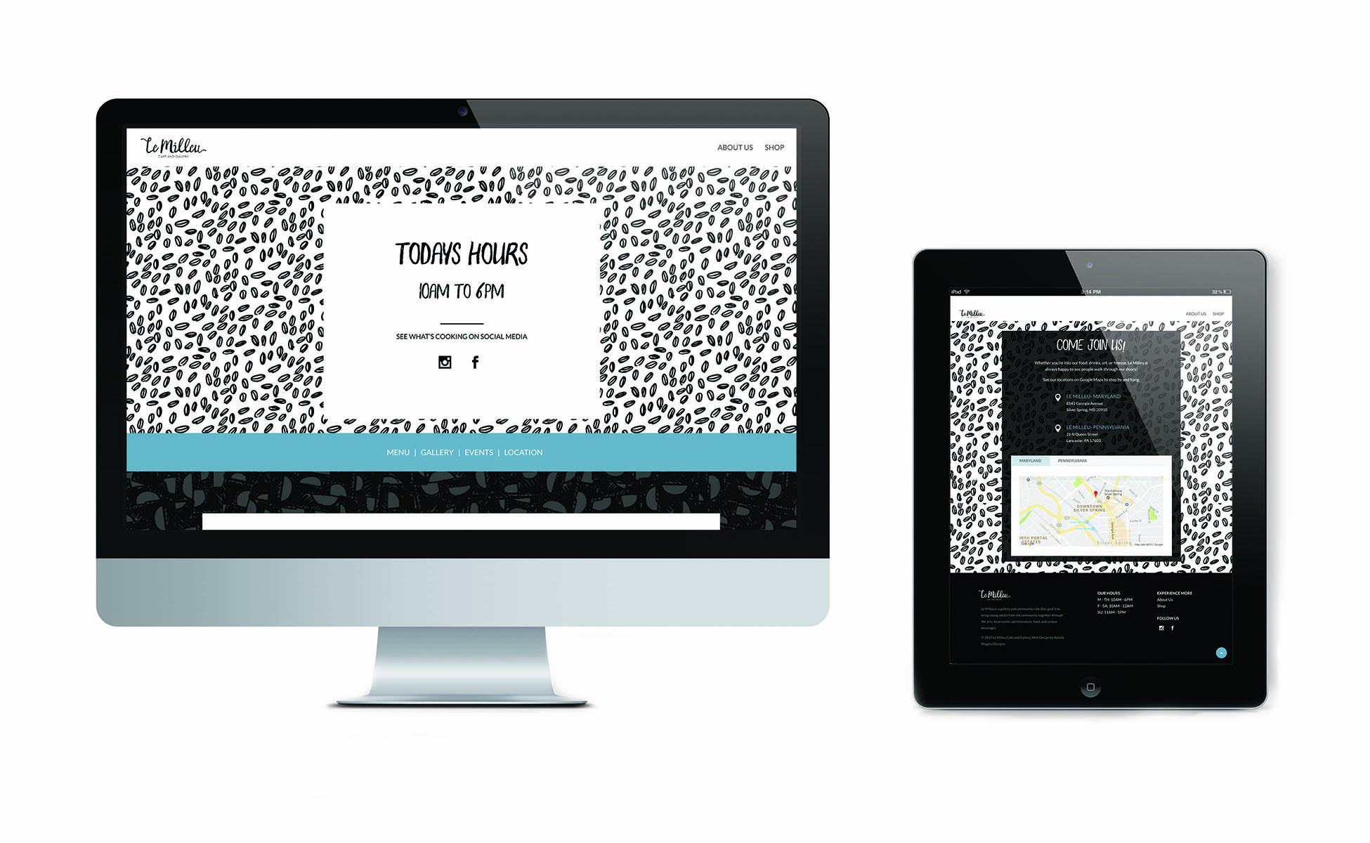
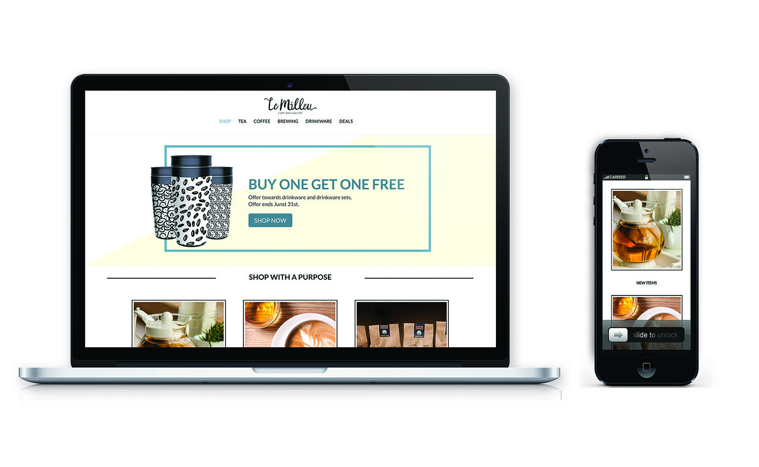
The Le Milleu website also takes forms of this familiarity. The repeated imagery of minimalistic patterns along with the color scheme creates a nice harmony from print to web. The website was created in WordPress with a regular home page, an extended shop page, and an about us page.
03 Final Design
The final project consists of a brand identity elements including: packaging, logo designs, promotional materials, social media content, poster designs, and a responsive WordPress website.
Copyright by Natalie Wiggins Designs 2024

